EVERGROVE
Made to belong.
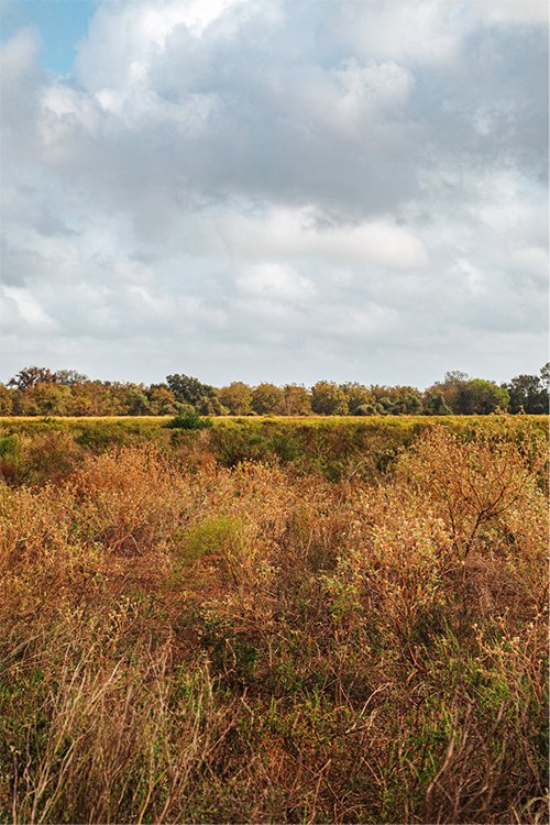
Not everything built belongs. Evergrove begins with land that already did — a former pecan farm shaped by time, care, and quiet character. The approach was simple: preserve what matters, and build with enough restraint that what’s new feels like it was always meant to be there.
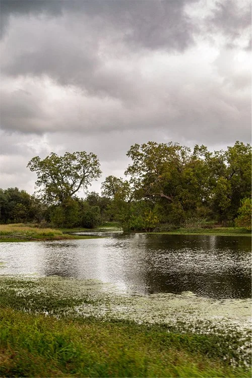
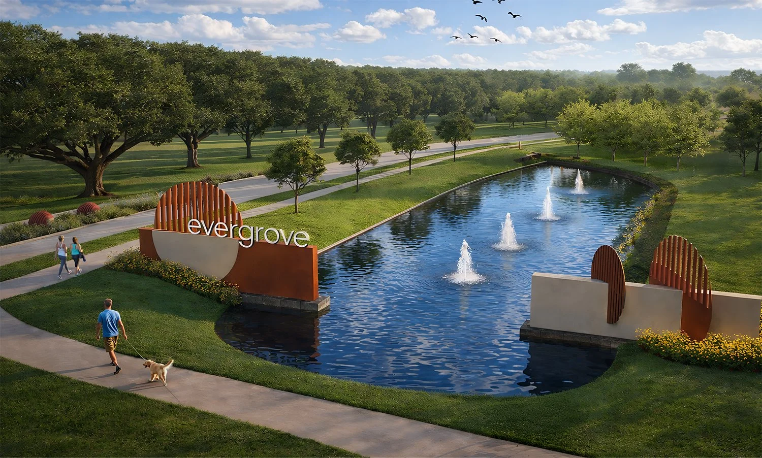
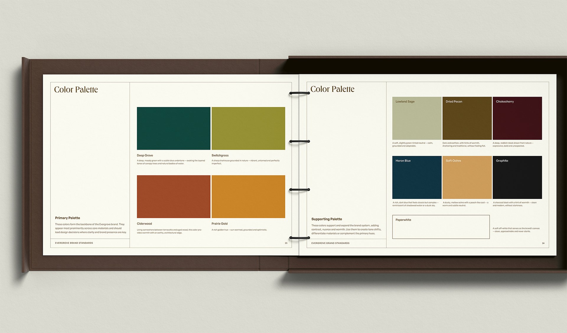
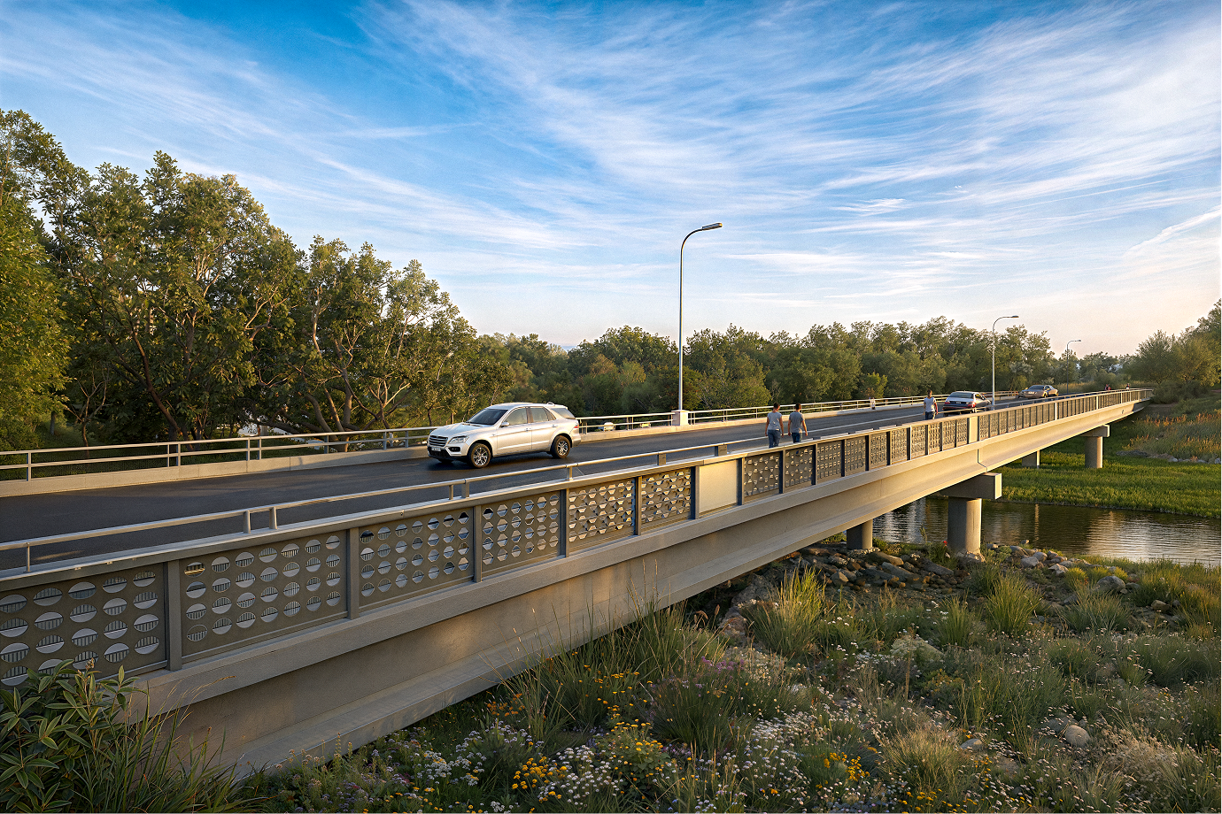
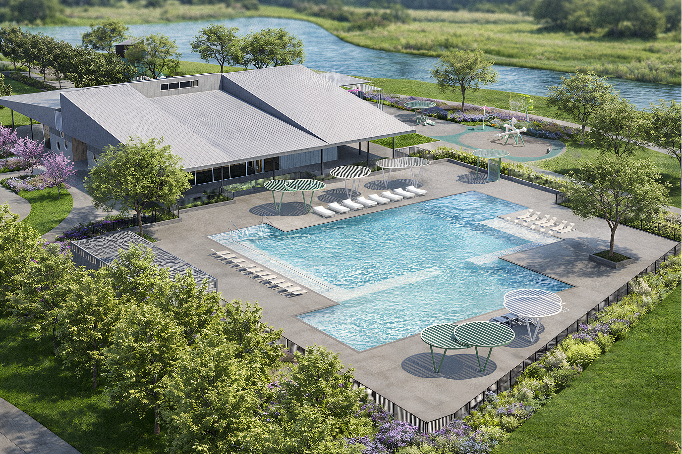
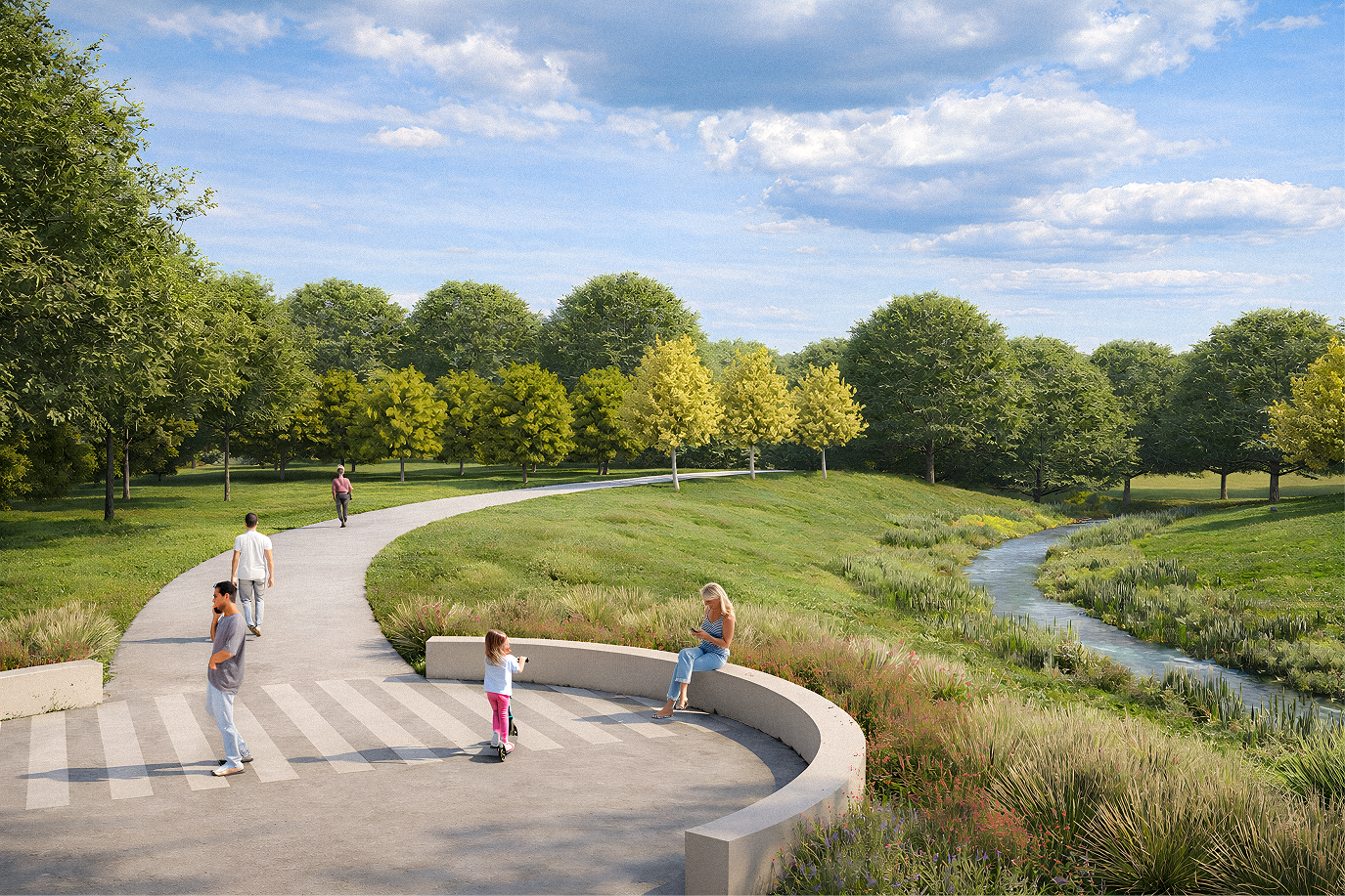
Walking the land made the direction clear — rolling ground, dense groves, water moving quietly through it. The identity distills those elements into a simple, modern mark: three forms held in balance, abstract but rooted in something real. That language extends beyond the logo, informing how the community takes shape — from entry moments to bridges and gathering spaces — creating a visual rhythm that feels connected to the land itself.
The identity balances restraint with energy — grounded in natural cues, but expressed with clarity, contrast, and a sense of life. It avoids the expected, leaning into a tone that feels both composed and distinctly contemporary.
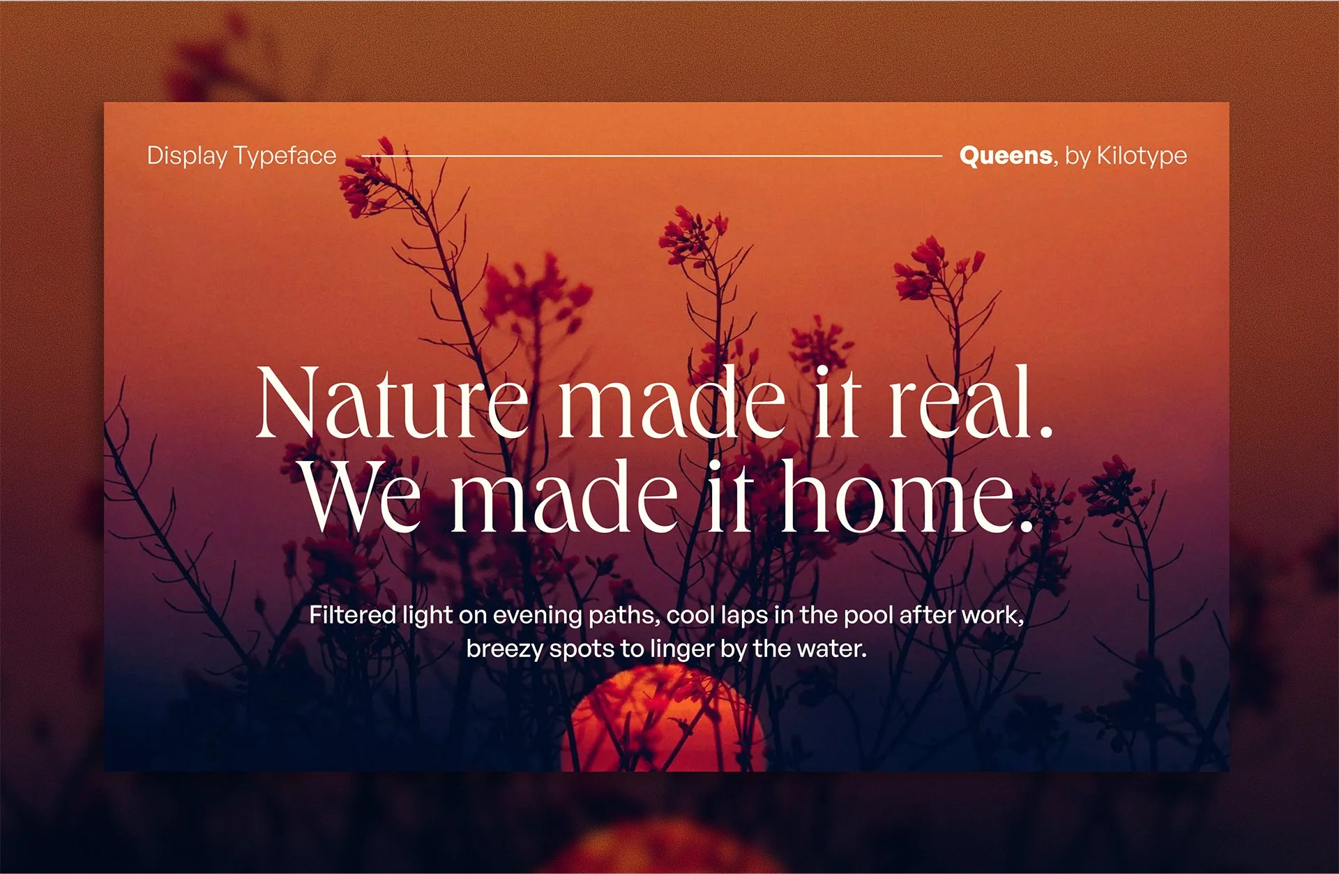
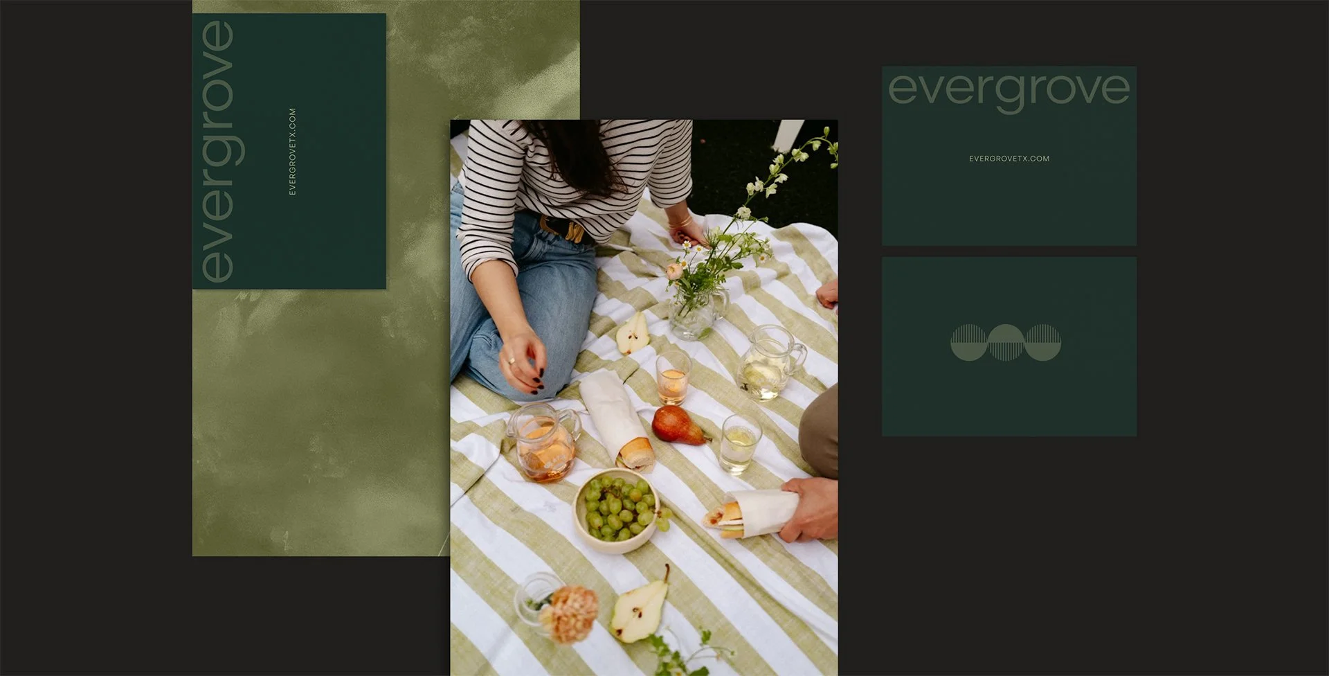
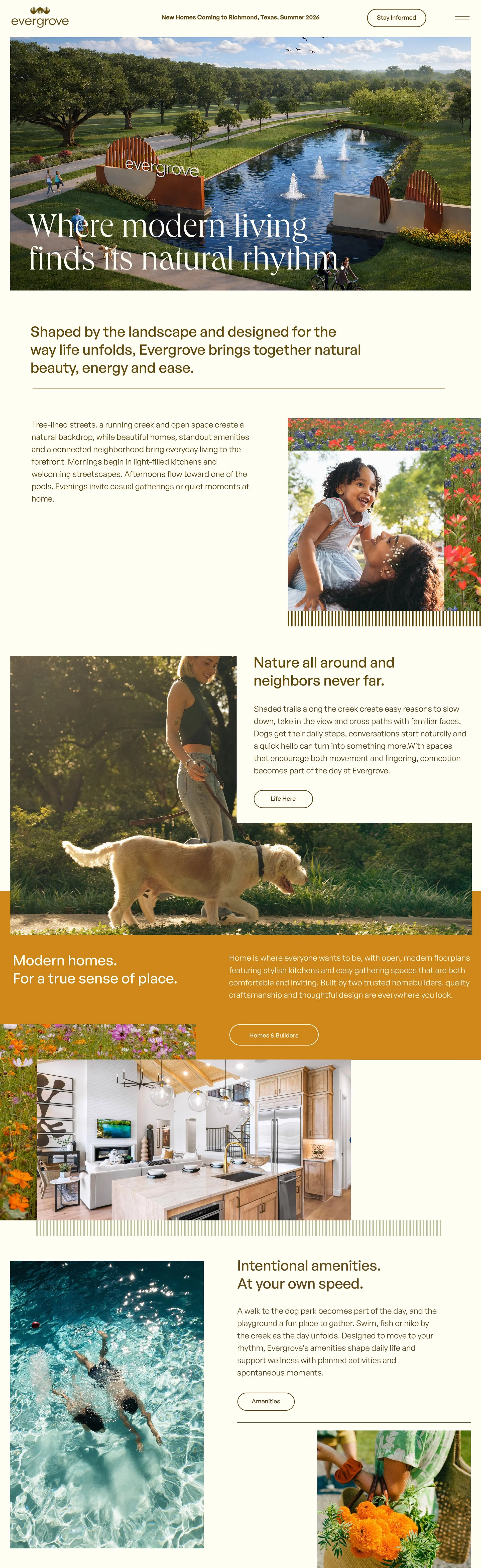
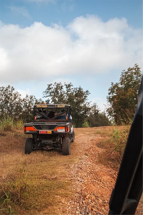
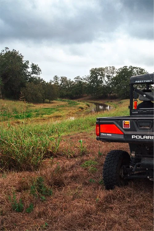
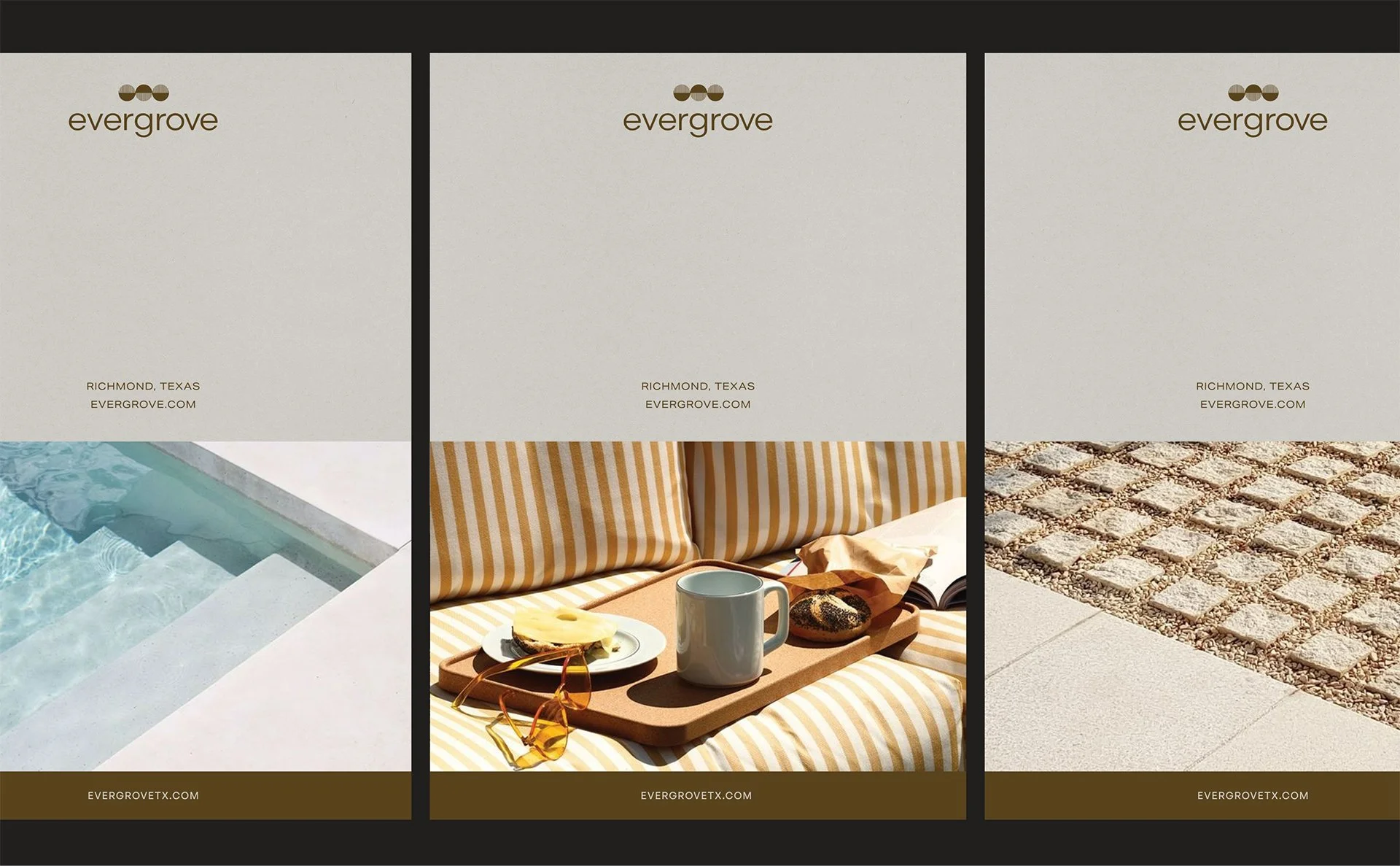
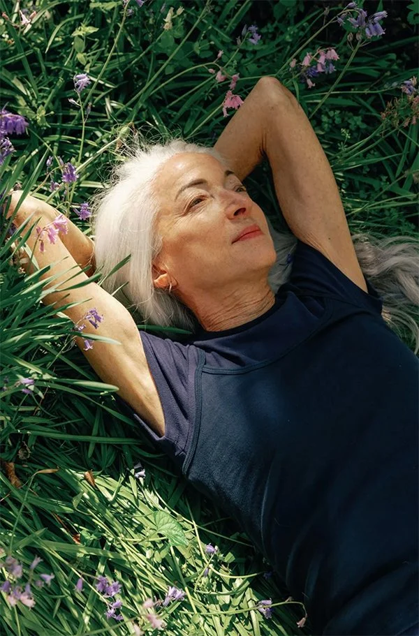
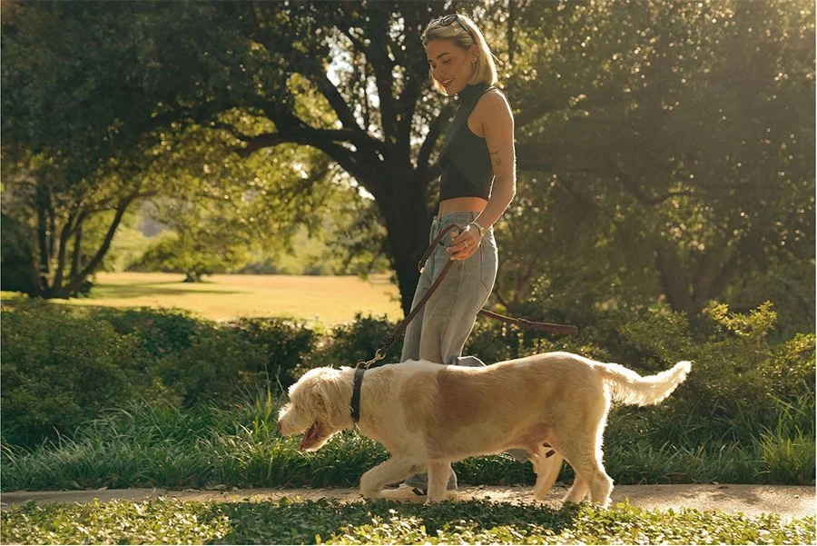
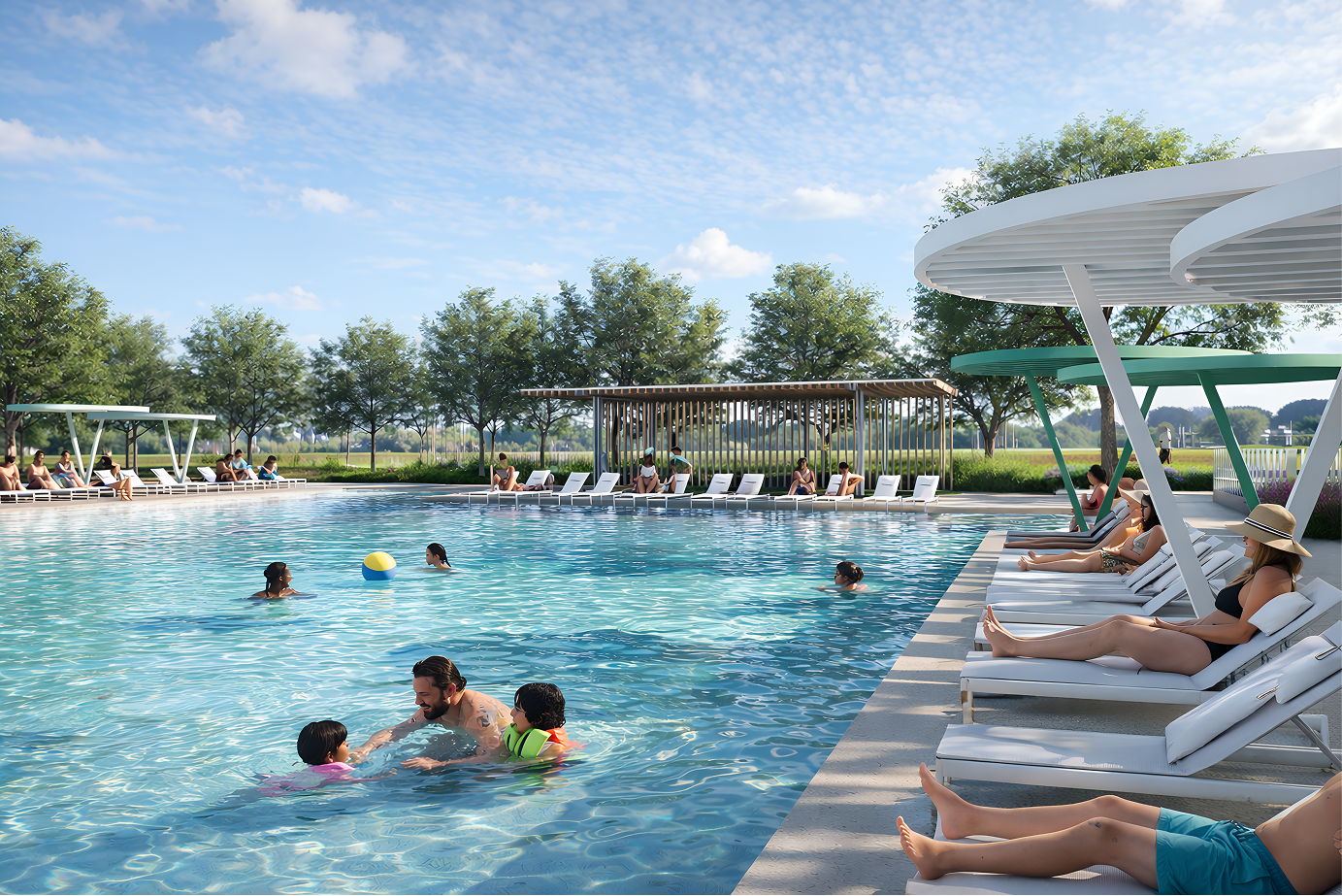
Imagery brings the place into focus — pairing daily life with a clear sense of design. Photography and film work together to capture both atmosphere and intention, showing a community that feels lived-in, considered, and visually cohesive.


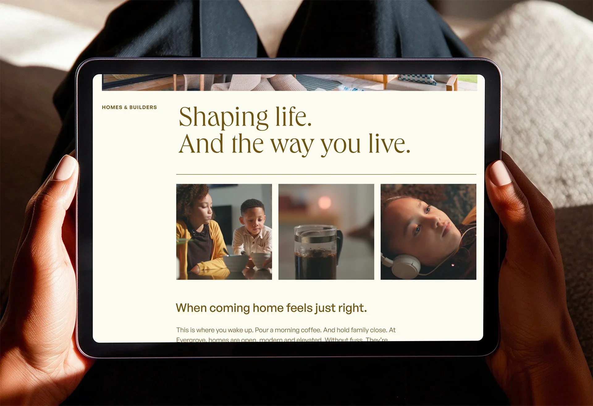
We created enhanced architectural renderings to support early-stage marketing and the development of the website — shaping light, detail, and atmosphere to move beyond presentation and toward something more immersive and real.
Designed as the long-term marketing hub, the website translates the brand into a living, digital experience — balancing clarity and warmth while capturing both the landscape and the life unfolding within it.