REVERIE RESIDENTIAL
For Dreams Well Lived.
Reverie Residential is a boutique real estate brokerage built on a simple but powerful belief: that the dreams worth pursuing are the ones grounded in clarity, intention, and possibility. When the company outgrew its previous name and identity, we partnered with founder Lindsay Dreyer to build a brand that finally matched the vision — confident, imaginative, and unmistakably elevated.
Our work spanned strategy, messaging, and a full visual identity system designed to attract a new generation of agents and clients while giving the brokerage a platform with room to grow.
CREATIVE DIRECTION
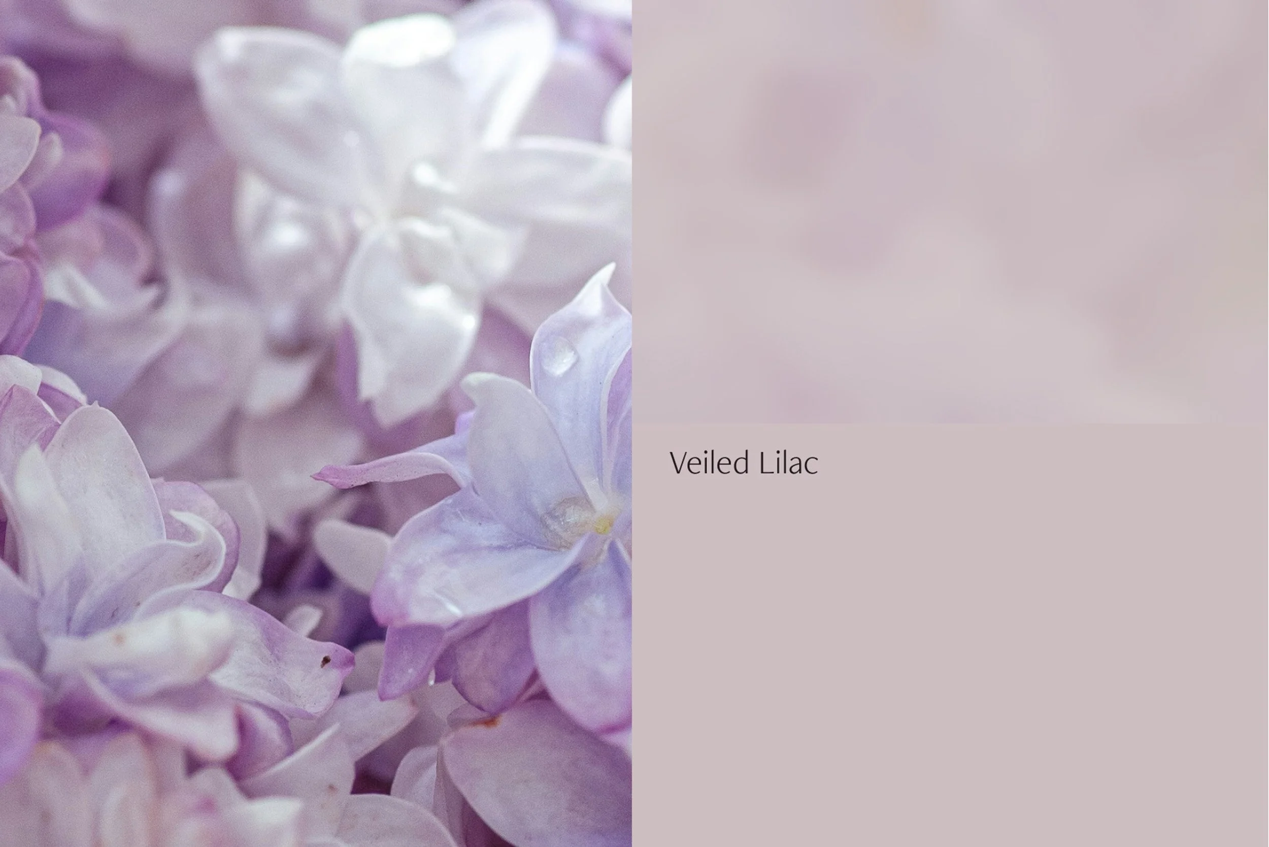
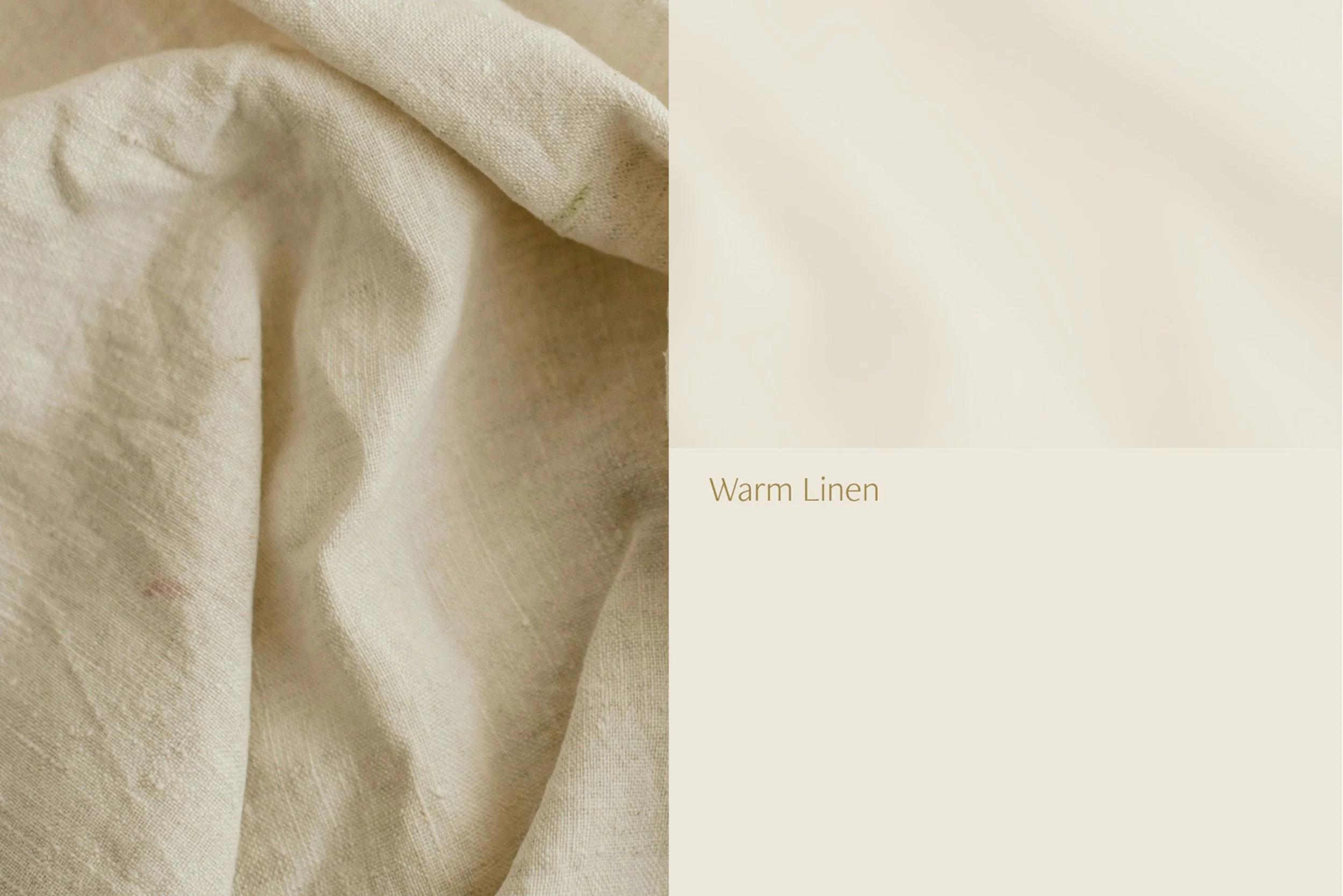
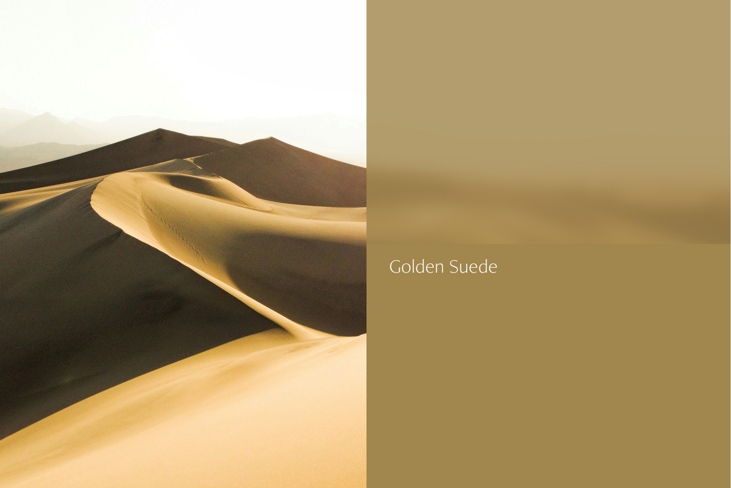
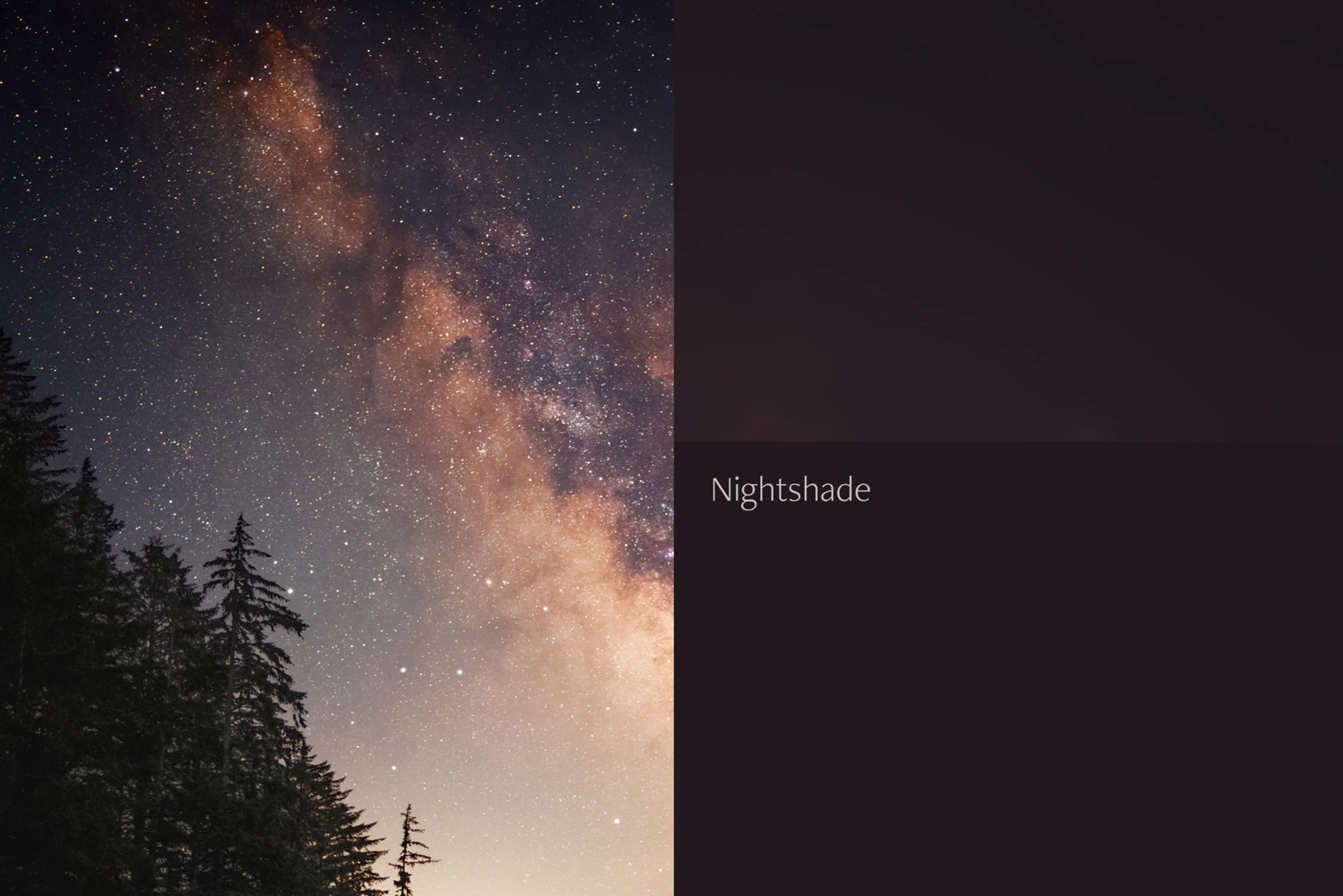
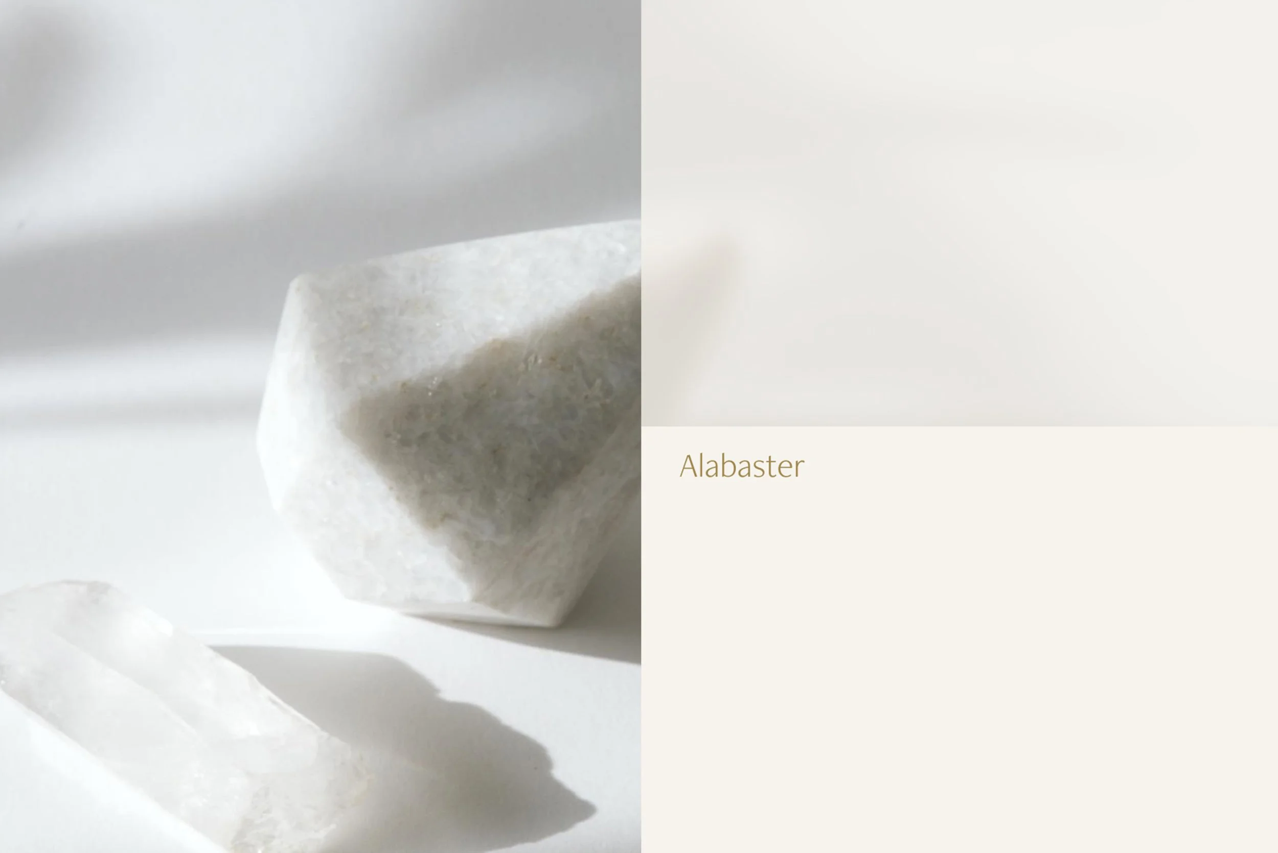
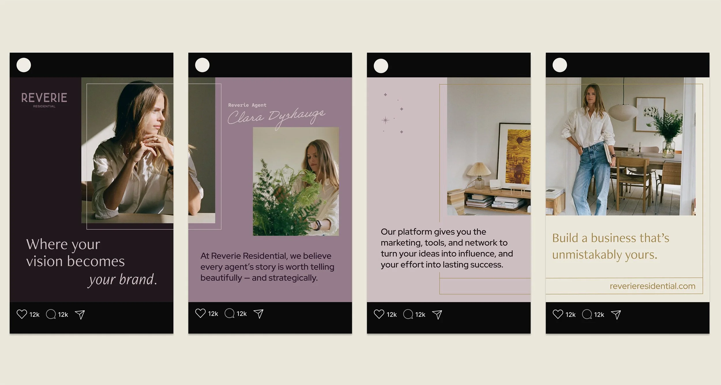
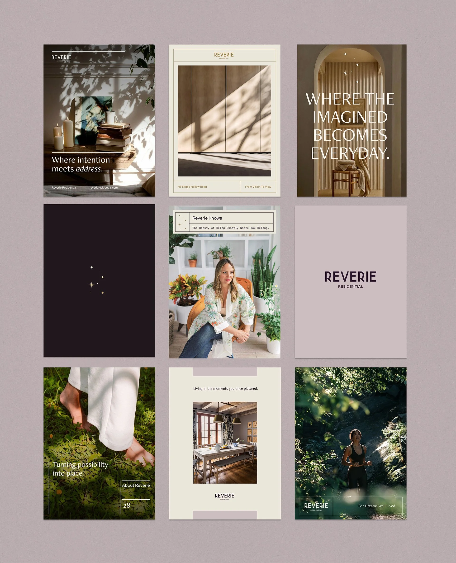
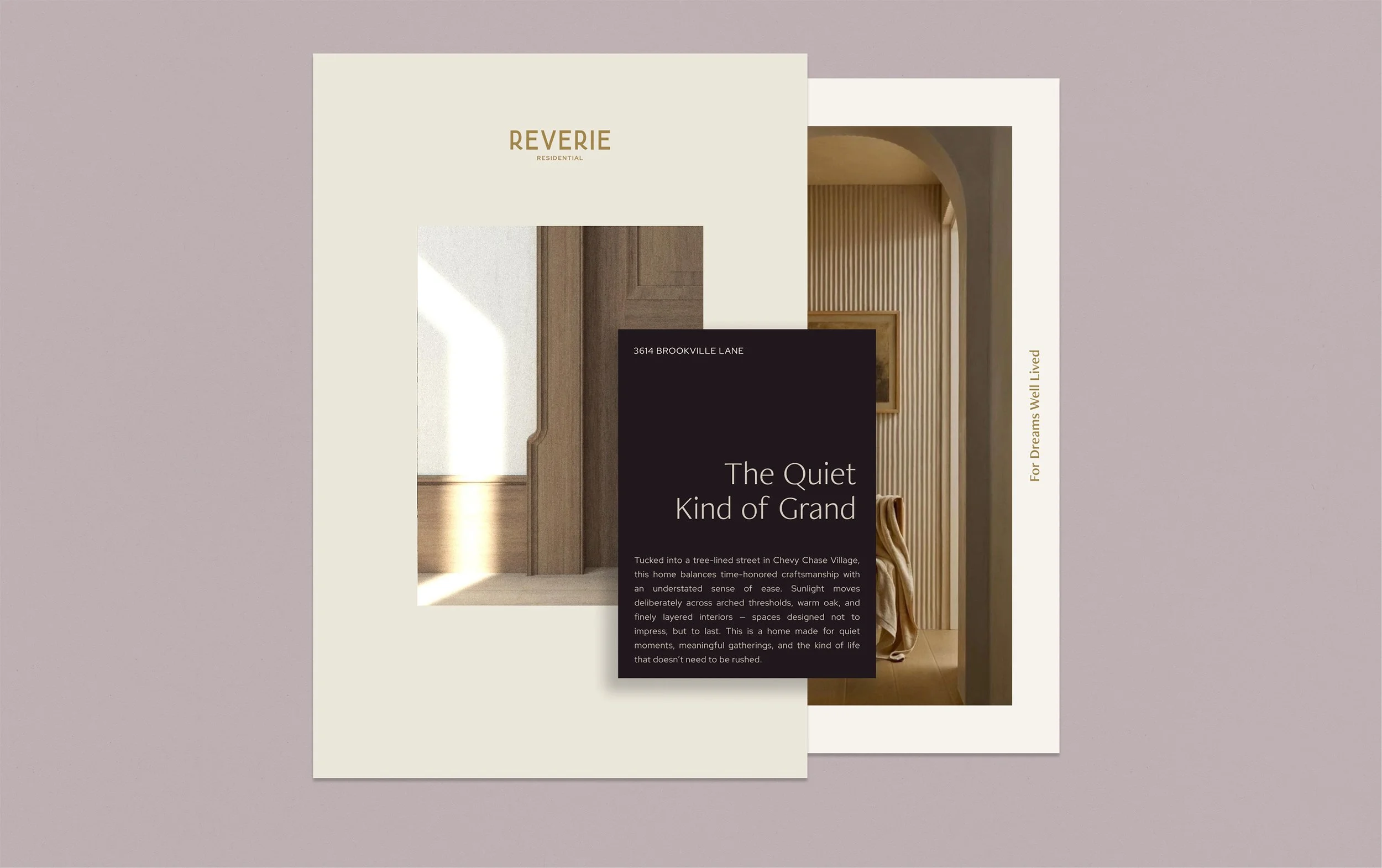
The creative direction for Reverie is rooted in atmosphere — warm light, quiet interiors, lived-in textures, and honest moments. Nothing glossy. Nothing staged. Just a visual world that feels intentional, modern, and deeply human. A space where clarity and calm become part of the brand’s promise.
The aesthetic leans into soft movement, considered spacing, and an editorial sensibility that cues taste without trying too hard. The brand expresses confidence by being understated — letting mood, tone, and craft do the work.
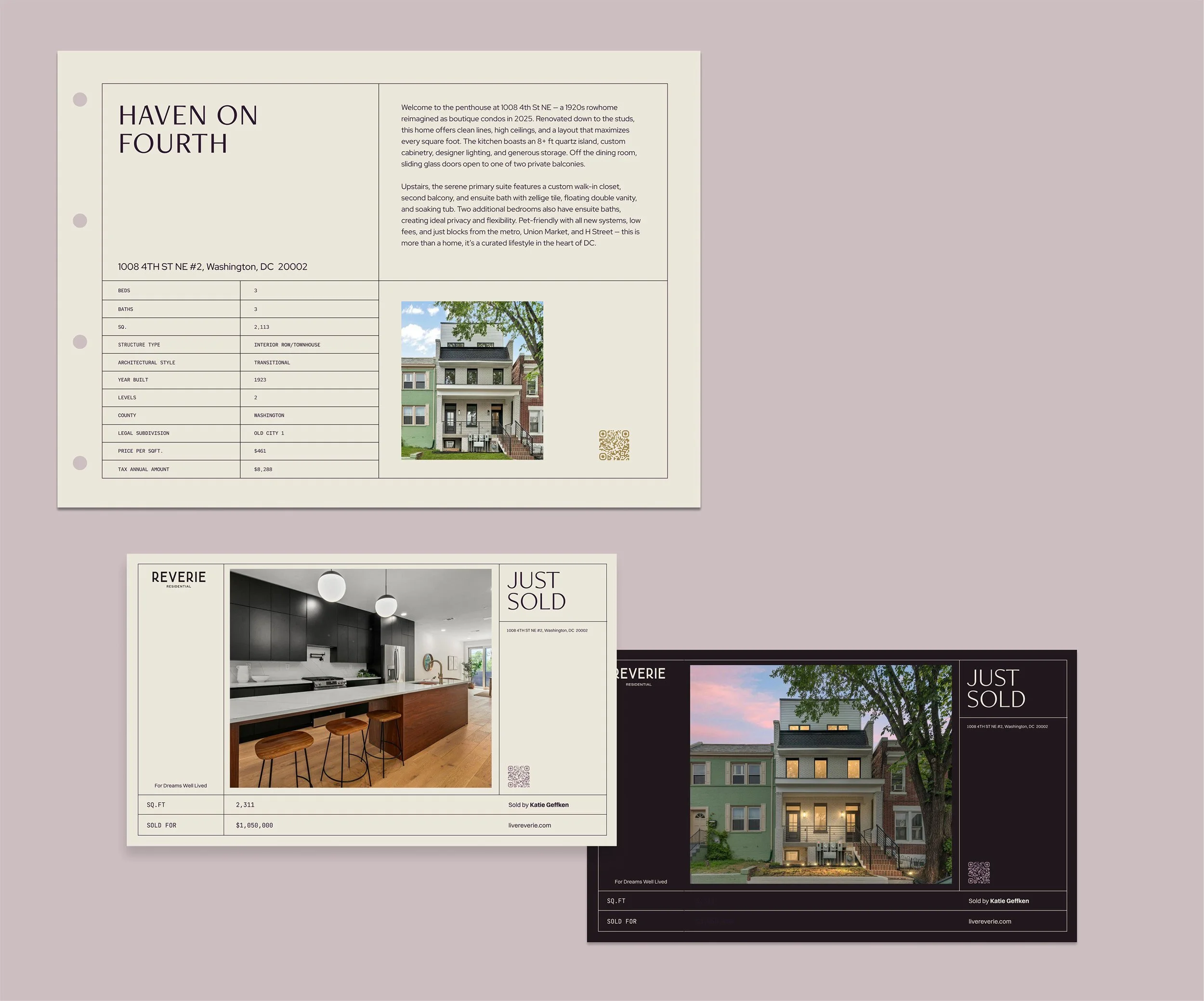
The color palette blends rich plums, soft neutrals, and warm metallics to create a world that feels mature, intimate, and quietly luxurious. These tones carry through the photography, materials, and layouts — offering a sense of cohesion that’s both restrained and expressive.
Positioning & brand foundation
Audience insights
Messaging framework
Visual identity system
Creative direction
Copywriting
Brand standards
Our Role
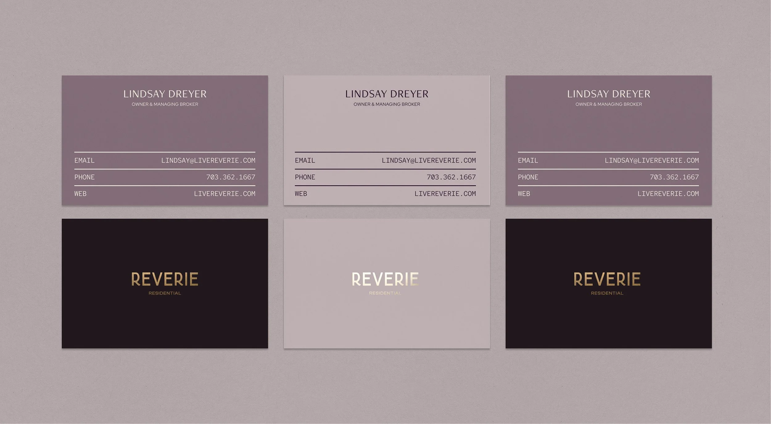


THE MARK
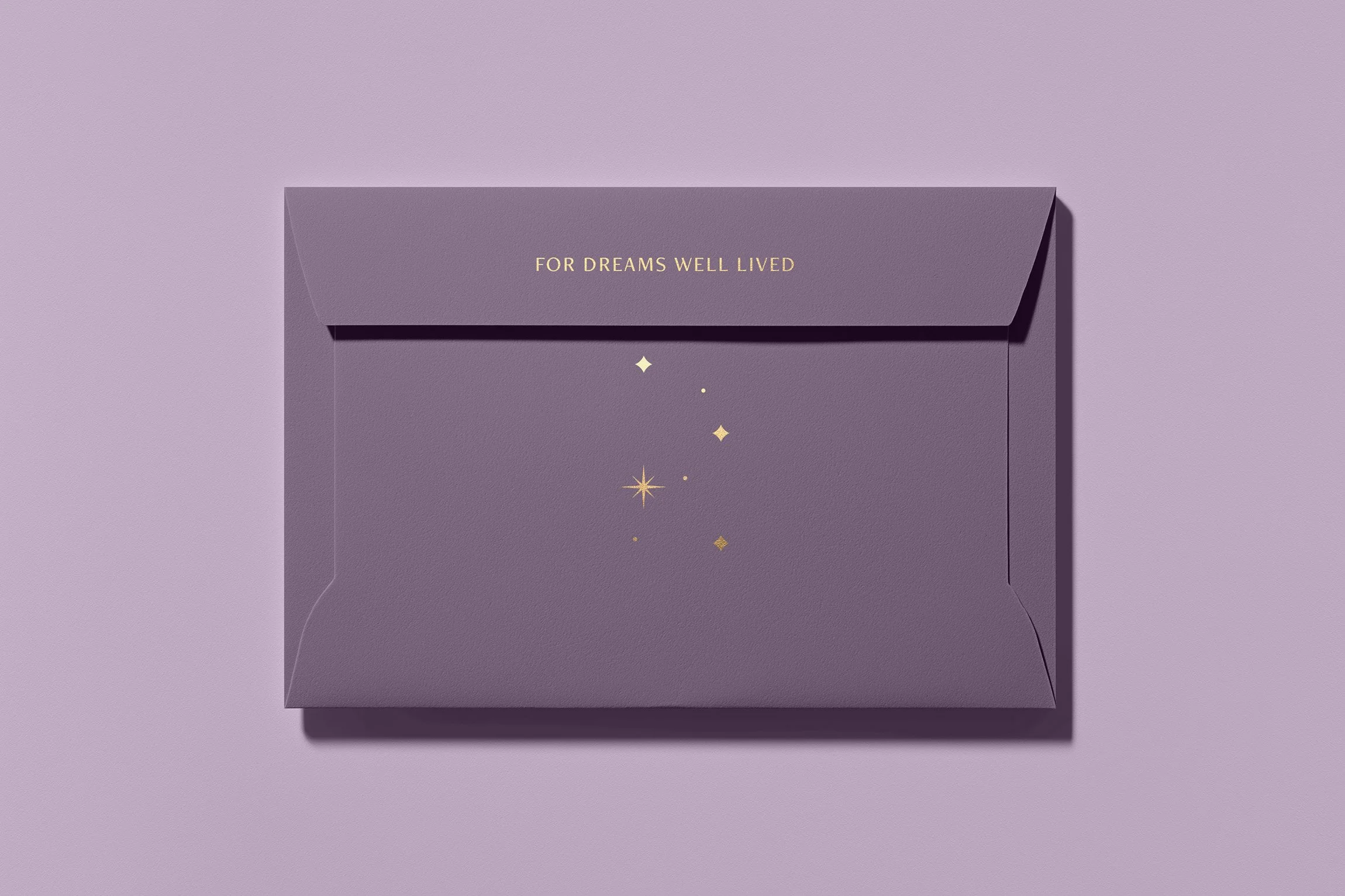
The constellation mark is a quiet signature within the system — a field of small celestial points arranged around the geometry of the “R.” It serves as a quiet visual reminder of what the brand stands for — a place where dreams take shape. Its composition echoes the role constellations have played for centuries, guiding travelers by small points of light that help orient, steady, and move them toward where they’re meant to go. Used sparingly, the constellation brings a sense of wonder and intention to layouts, reinforcing the brand’s belief that a well-lived life begins with a vision worth following.

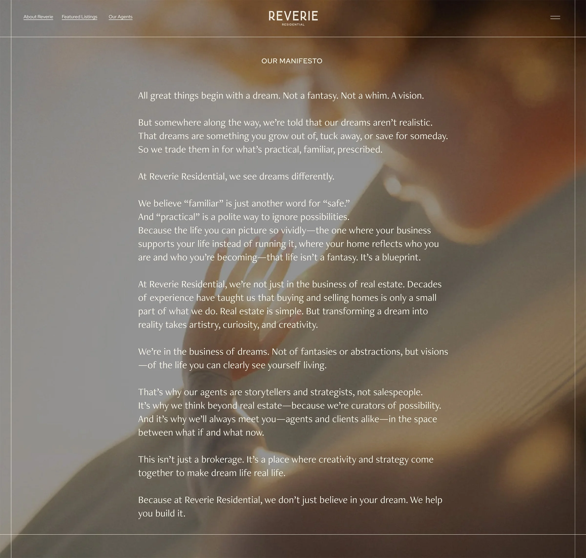
A TAGLINE THAT HOLDS THE BRAND TOGETHER
For Dreams Well Lived became the center of the brand — a clear expression of Reverie’s role in helping people move toward the lives they can picture for themselves. It articulated the emotional foundation for everything that followed. The manifesto then expanded that idea into a full point of view: that dreams aren’t fantasies or whims, but blueprints for who you’re becoming. It gave the brand a narrative engine — something agents could rally behind and clients could immediately understand.
IN THEIR WORDS
“Working with Tuo truly felt like a partnership. We were rebranding and renaming our 14-year-old company — starting from scratch — which could have felt overwhelming. Instead, the process was collaborative, thoughtful, and energizing. They created space for open, honest conversation and took every piece of feedback seriously, translating it into work that felt both considered and deeply authentic to us.
The discovery process was especially eye-opening. It surfaced insights we hadn’t articulated before and provided clarity about who we are and how we present ourselves. The results have been incredibly well received, both by our team and the people we serve. We now have a brand that feels aligned and strategic — a foundation we can confidently build on as we grow. I’d recommend Tuo to anyone looking for a partner who will guide you thoughtfully and help express the true heart of your business to the world.”
Lindsay Dreyer, Owner & Managing Broker, Reverie Residential